Having Trouble Deciding What to Wear?
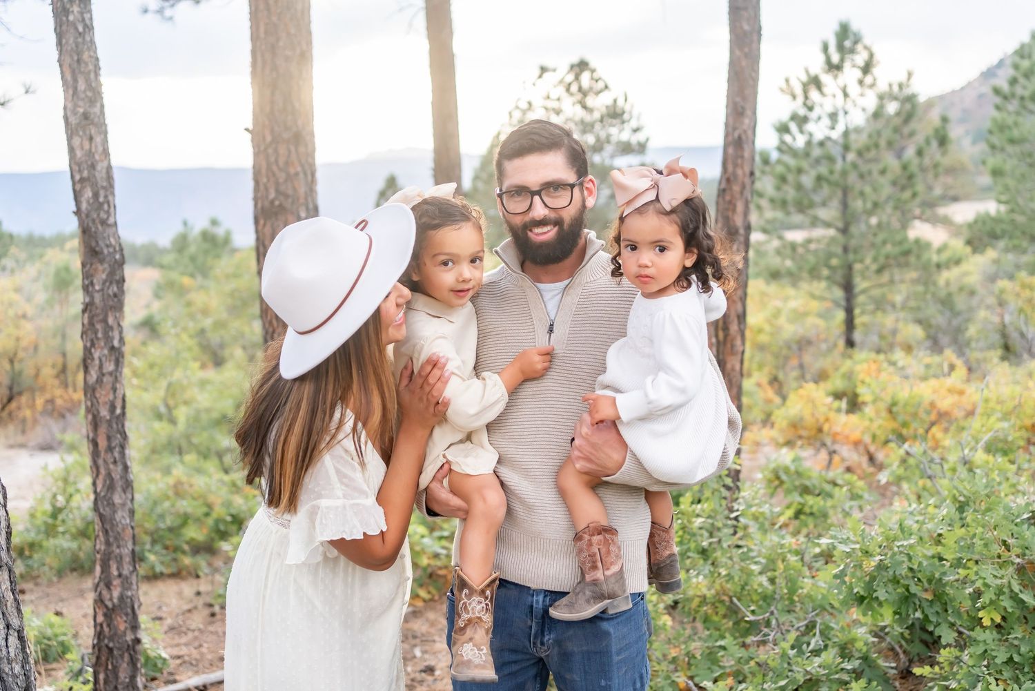
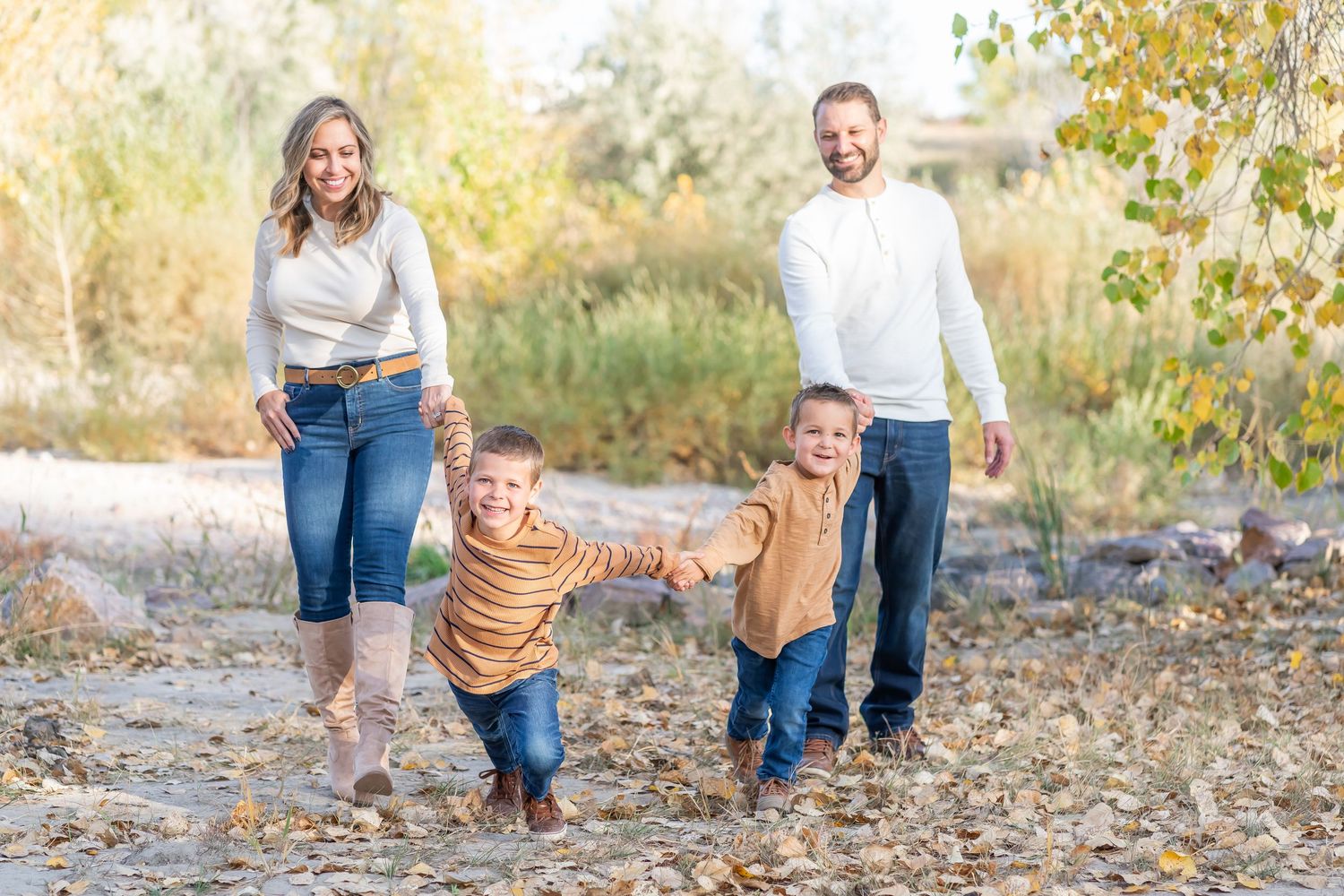
No worries! I am so happy to help guide you in the right direction for your outfit choices. One of the most difficult and stressful tasks for a family photoshoot is putting your outfit and your families outfits together. Let me take that stress off your shoulders!
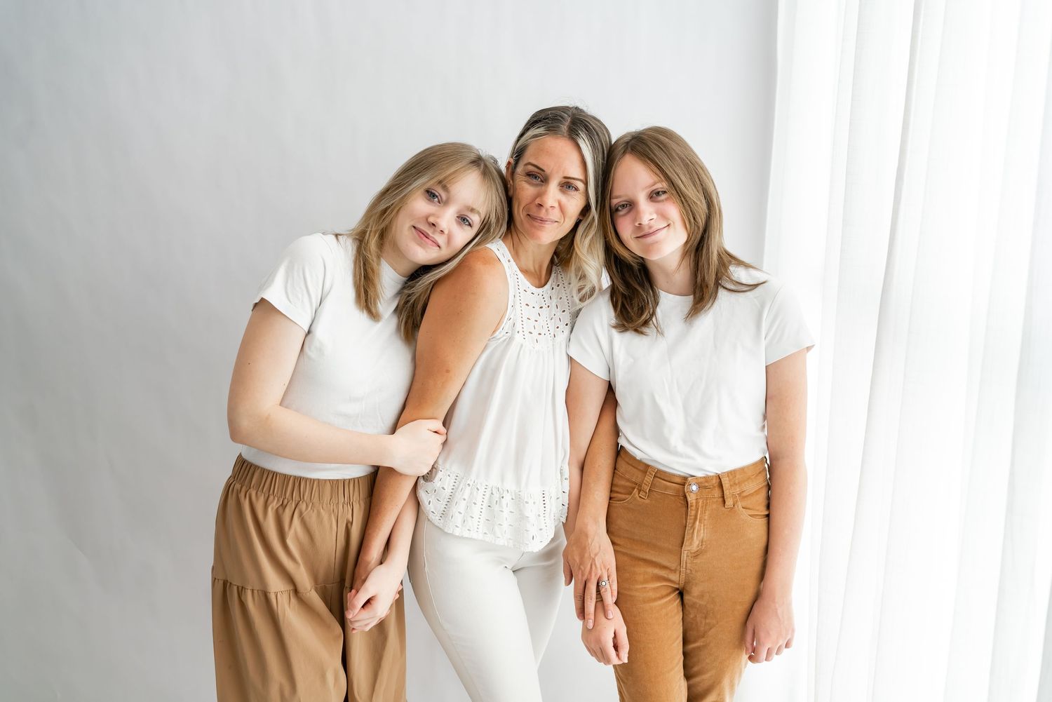
Natural & Neutral Colors
1. They Keep the Focus Where It Belongs
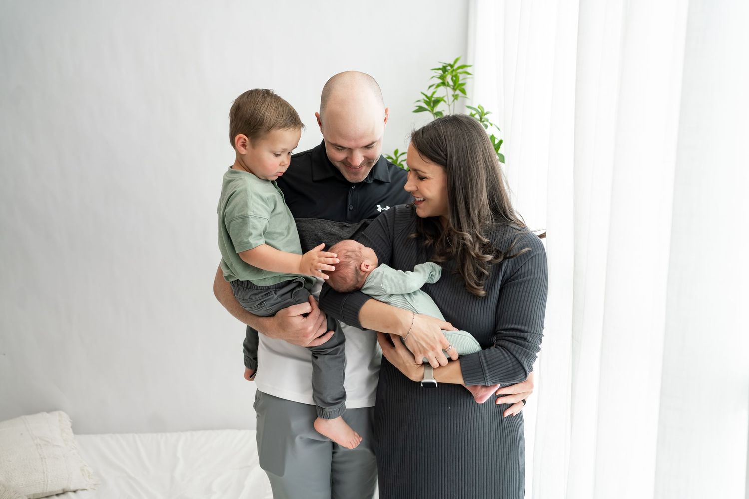
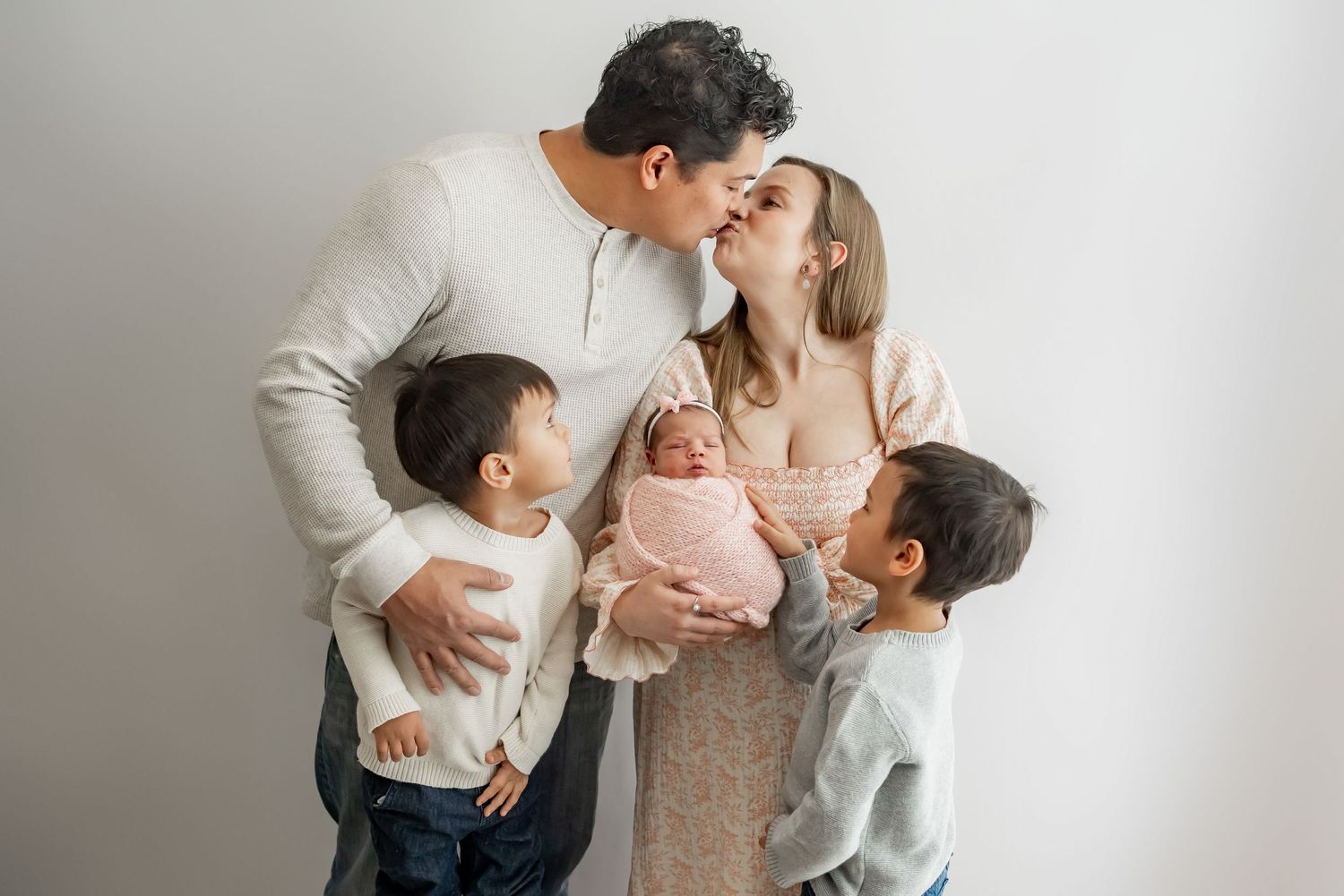
Neutral tones don’t compete for attention. They allow the true stars of your photos—your faces, your emotions, your connection—to shine. Your outfits should complement the moment, not distract from it.
2. They Blend Beautifully with Nature
If we’re shooting outdoors (in a field, forest, or mountainside), earthy and soft tones naturally harmonize with the environment. This creates a cohesive, calming palette that feels organic and effortless.
3. They Create a Timeless Look
Bold patterns and bright colors can date your photos. But neutrals have a classic, never-goes-out-of-style appeal, making your images something you’ll love just as much in 20 years as you do today.
4. They Make Group Coordination Easy
When everyone wears subtle, complementary shades, it’s easy to coordinate without matching exactly. It gives the group a soft, polished look without being too “matchy-matchy.”
5. They Work Beautifully with Natural Light
My photography style relies on soft, natural lighting, and neutral tones reflect that light in the most flattering way—giving your skin a gorgeous, glowy warmth.
Solid vs. Patterns
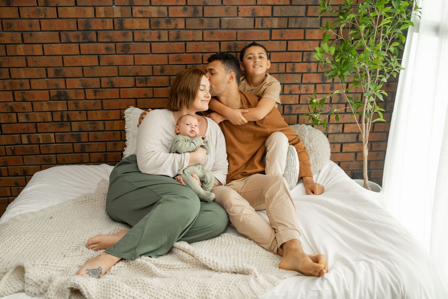
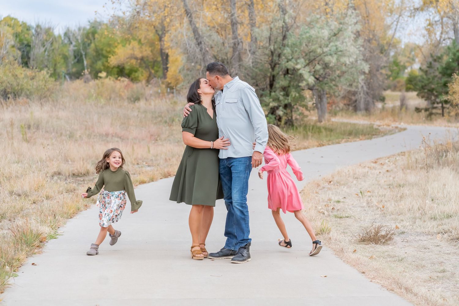
Why Choose Solid Colors Over Patterns for Your Photoshoot
Picking what to wear is one of the most important parts of getting ready for your session—and what you wear truly impacts the final look of your photos. While patterns can be fun in everyday life, for photos, solid colors almost always photograph better. Here's why:
1. Solid Colors Keep the Focus on You
Your connection, emotions, and expressions are the heart of your images. Busy patterns can pull the eye away and distract from the moment, while solids help keep the attention where it belongs—on your face and relationships.
2. Patterns Can Clash or Date Your Photos
Trendy prints or loud patterns may look fun now, but they can feel dated quickly in photos. And when multiple people wear different patterns, they can easily clash or create visual noise, making the overall image feel messy.
3. Solids Create a Timeless, Clean Look
Solid tones—especially in neutral, earthy, or soft colors—create a harmonious and timeless feel. They photograph beautifully in natural light and look amazing whether we’re in the studio, in a field, or at home.
4. Patterns Can Distract the Camera
Certain patterns (like tiny stripes or plaids) can create strange effects on camera (called “moiré”), making your clothes look distorted or fuzzy. Solid fabrics are always a safer, more polished choice.
5. You Can Still Add Texture & Layers
Worried about looking too plain? Don’t be! Solid doesn’t mean boring. You can add visual interest with:
- Textured fabrics (like knits, linen, lace)
- Layers (cardigans, vests, wraps)
- Subtle details (embroidery, ruffles, jewelry)
Bonus Tip:
If you do want to include a pattern, choose just one person in the group to wear a simple, subtle print (like soft florals or a muted plaid), and keep everyone else in coordinating solids.
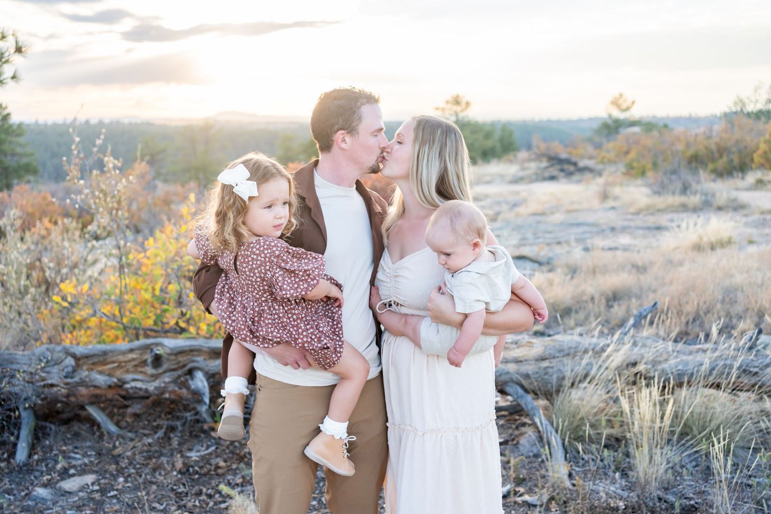
Why coordinate vs match?
1. It Looks More Natural & Modern
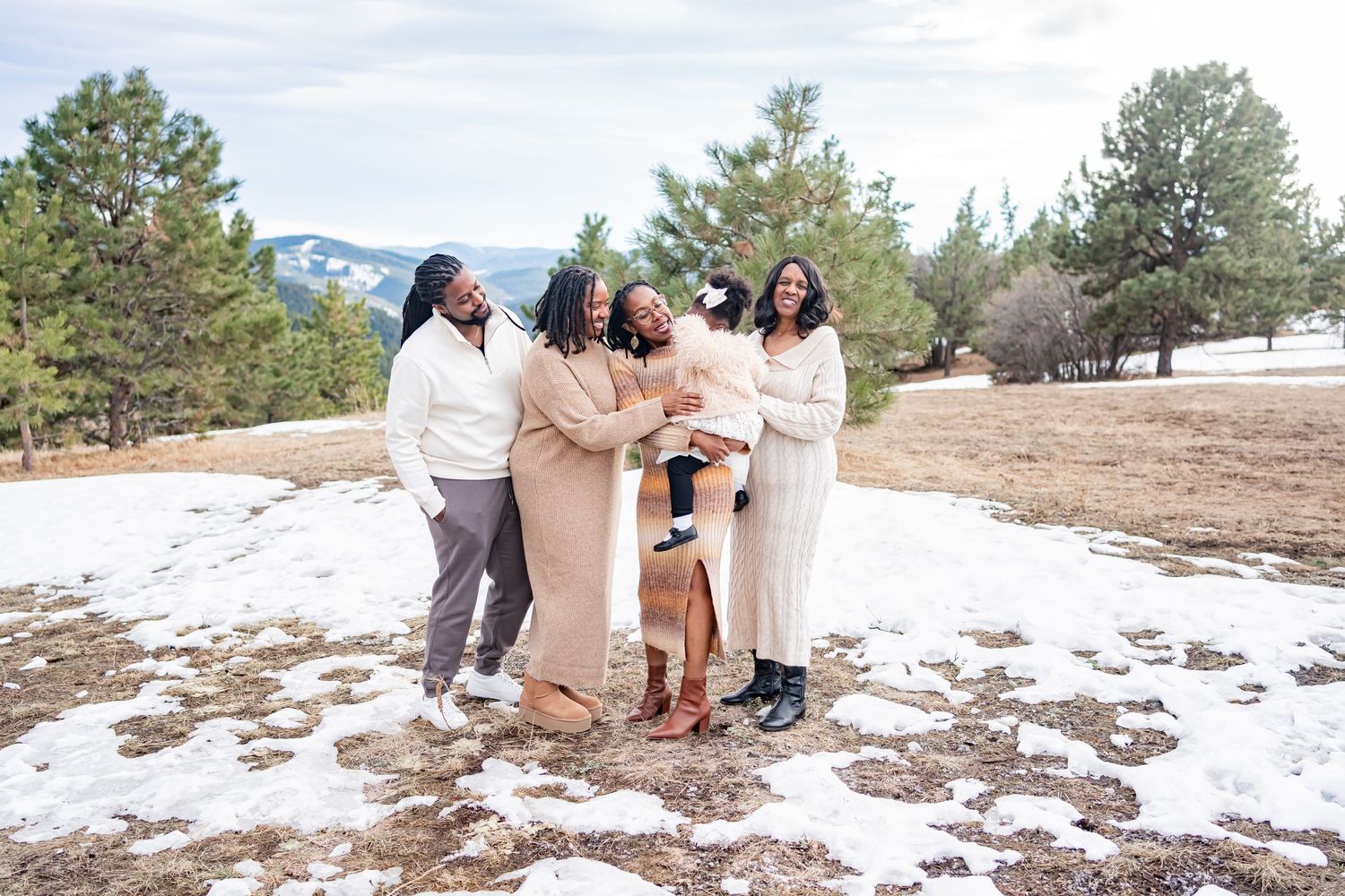
When everyone is dressed exactly the same, it can look forced or outdated. But when your outfits coordinate in tone, texture, and style, you’ll look more relaxed, modern, and authentic.
2. It Shows Off Individual Personalities
Coordinating allows each person to wear something they love—while still contributing to the overall look. It celebrates your family’s uniqueness without clashing.
3. It Creates a Soft, Balanced Look
When your colors and styles complement each other, your photos will feel harmonious and visually pleasing—without looking too “posed.”
so then how do we coordinate?
1. Choose a Color Palette (3–4 Colors Max)
Start with one or two base colors (like cream, tan, soft gray) and add in a pop of a soft accent (sage green, dusty rose, muted blue). Think earthy, natural, and soft tones that flow together.
Example Palette: Cream, warm taupe, dusty rose, and soft olive green.
2. Mix Textures, Not Prints
Textures like knits, denim, lace, or linen add visual interest without competing. Limit bold patterns and avoid logos or characters. If someone wears a pattern, keep it subtle and limit it to one person.
3. Think in Layers
Add cardigans, wraps, vests, or accessories in coordinating tones to bring variety without clashing. Layers photograph beautifully and let you adjust on-site if needed.
4. consider the setting
Match your tones to the environment. For nature sessions, soft earth tones work beautifully. For studio or urban sessions, you can add a bit more contrast—but still aim for cohesion over uniformity.
5. Lay It All Out Together
Before your session, lay all outfits side by side on a bed or floor. If nothing jumps out or clashes, you’re good to go. Snap a photo and send it to me if you’d like a second opinion—I'm always happy to help!